With the release of the Marcel the Monkey projections, it time to start my yearly analysis of projected lineups. I run Marcel projections through the Lineup Analysis Tool (LAT) to present a comparison of the manager’s lineup to an “ideal” lineup.
Lineups, in fact, make very little difference. I enjoy the exercise as a way to see how managers think about their batting orders.
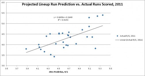
The following graph shows how the 2011 predicted runs/game for the projected lineup from the LAT compared to the actual runs per game for the team:
There was a 0.64 correlation between the predictions and the actual numbers. That’s not too strong, but it’s in the right direction.
For each team I’ll present four numbers for runs per game:
- Best lineup
- Projected lineup
- Worst lineup
- Regressed lineup
The regressed prediction is based on the projected lineup. I now have four years of data on which to build the regression equation. This year it will be y = 0.7626x + 0.7835, where x is the runs per game for the projected lineup.


seens like a pretty good correlation
BENJAMIN MARCUS RAUCHER